There’s a quiet revolution going on in British homes, and it’s not just about smart thermostats or modular sofas. It’s colour. Not the trendy colours of five years ago—those cool greys that made every lounge feel like a waiting room—but a bolder, warmer, more expressive palette that reflects something deeper. Something emotional. In 2025, colour trends in the UK are no longer about following fashion. They’re about feeling better at home.
We’ve seen the shift coming. Dulux, Farrow & Ball, WGSN, and even interior design TikTokers are all pointing in the same direction: a collective move towards grounded, personal tones that reconnect us with nature, warmth, and self-expression. If you’re renovating, redecorating, or just tired of beige on beige, this is the year to lean in.
Let’s unpack what’s happening—and how to bring it home.
Why Colour Feels So Personal Right Now
After years of instability—lockdowns, inflation, energy price surges—UK homeowners are craving comfort. Not just physical comfort, but emotional reassurance. Paint companies report a noticeable shift in buyer language. Customers aren’t just asking what’s “in”; they’re asking how a shade will feel. Will it make my kitchen warmer in winter? Will it brighten my north-facing lounge? Can I live with it, even on a dreary February morning?
Colour trends in 2025 are responding to those questions. We’re seeing softer yellows, earthy browns, lush greens, and deep, soul-stirring blues take centre stage. These aren’t sterile show-home shades. They’re tactile, lived-in, and often inspired by materials found in nature—clay, sand, moss, stone.
Even neutrals are getting an upgrade. Forget cold magnolia or harsh white. Today’s neutrals are “cashmere”, “plaster”, “chalk”, “flax”. They carry a texture and tone that feels calming, not clinical.
The Five Big Colour Stories of 2025
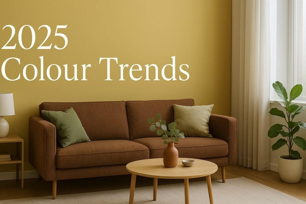
1. Warm Optimism: The Yellow Revival
2025’s most uplifting turn? Yellow. But not just any yellow—this year’s tones are buttery, soft, and full of light. Dulux’s Colour of the Year, Sweet Embrace, sits in this family, while others like Celestial Yellow from WGSN add a hint of sunshine to spaces starved of natural light.
Best for: Kitchen nooks, hallway panelling, under-stair alcoves.
Try it if: You want to trick your eye into thinking it’s spring, even when the radiator’s on full blast.
2. Earth and Spice: Brown Is Back (Yes, Really)
Rich chocolate tones, rusty paprika, cinnamon, and even terracotta are creeping into UK homes. The Earth & Spice palette is all about grounding—a throwback to 1970s comfort but with a contemporary matte finish.
Best for: Dining rooms, sitting rooms, and open-plan spaces that need warmth and definition.
Pro tip: Paint your skirting boards and door in the same spicy tone as your walls for a unified, high-end look.
3. Regenerative Greens: Nature Comes Indoors
From moss to matcha, green is dominating colour trends this year. WGSN calls it “Regenerative Design”—a way of reconnecting our tech-heavy lives with organic calm. These greens aren’t too bright or too cool; they’re murky, mossy, and perfectly imperfect.
Best for: Bedrooms, bathrooms, and any place where you want to unwind.
Low-commitment idea: Use green limewash paint on a small sideboard or wardrobe. The texture hides brushstrokes and gives instant character.
4. Jewel Tones Reimagined: Not Just for Period Homes
We’re talking Cherry Lacquer, Aubergine, Petrol Blue. Deep, moody colours that feel theatrical in the right space—but also surprisingly calm. These jewel shades aren’t necessarily new, but they’re showing up in fresh ways: paired with natural textures, dead-flat finishes, or unexpected furniture shapes.
Best for: Media rooms, moody bedrooms, bold powder rooms.
Design tip: Keep your jewel tone as the only “loud” element. Let wood, brass, or cotton balance it out.
5. Elevated Neutrals: Softness Wins
Greys are getting softer. Whites are warming up. The new neutrals borrow from plaster, putty, sand, and unbleached linen. They’re versatile and forgiving, especially in smaller flats or homes with mixed light.
Best for: Kitchens, utility rooms, rentals where you want calm without losing character.
DIY idea: Switch your white ceiling to a chalky cream or blush. It’s a subtle shift that makes the room feel finished.
Finishes Matter (Almost) As Much As Colour
One thing that’s made 2025 colour trends especially exciting is the rise of specialist finishes. More of us are opting for:
- Clay paint: Zero VOC, breathable, and velvet-matte.
- Limewash: Great for uneven walls or a rustic look.
- Dead-flat emulsions: Remove the “plastic” sheen from bold colours.
Finish choice can make or break your final result. A deep cherry red in gloss? Overwhelming. But in a dead-flat, chalky finish? Elegance.
Lighting: The Secret Sauce of Colour
Let’s get real: no colour looks the same at 10am and 7pm in the UK. Our cloudy skies and long winters mean that light direction and warmth can alter paint dramatically.
Here’s a quick cheat sheet:
| Room Direction | Best Colours |
|---|---|
| North-facing | Warm tones like peach, cream, or spice |
| South-facing | Cool greens, dusky blues, warm grey |
| East-facing | Soft neutrals, sage, pale yellow |
| West-facing | Terracotta, sunset pink, deep olive |
Always sample your colours on all four walls before committing. Paint behaves differently on each surface, especially under warm bulbs vs daylight.
Budget-Friendly Ways to Follow Colour Trends
You don’t need to rip out your entire kitchen to keep up with 2025’s look. Here are four low-effort ways to experiment:
- Switch accessories: New cushion covers or a statement lamp in Future Dusk can update a neutral room fast.
- Paint the woodwork: Just doing the skirtings or door frames in a new tone gives contrast without full repainting.
- Use tester pots: Paint a large lining paper square and stick it on the wall. Move it around to see how it shifts.
- Decorate in thirds: If you’re nervous, use the 60/30/10 rule—60% neutral, 30% colour trend, 10% accents.
What Colour Trends Say About Us in 2025
When you step back, these colour trends aren’t just aesthetics. They’re cultural. They reflect our desire to nest, to express, to escape. They mirror sustainability goals, individualism, mental health awareness. Whether it’s bringing matcha green into a chaotic household or wrapping your bedroom in cinnamon slate, you’re making an emotional choice as much as a visual one.
And that’s what good colour should do—it should change how you feel in your own space.
So if you’ve been hesitating to go bold, 2025 is your sign. Colour trends aren’t about what your neighbour is doing—they’re about what feels right for you.
Roll up your sleeves. Open a tester pot. See where it leads.