If you’ve ever stood in the middle of a room holding a paint swatch and wondered how bold is too bold, the coming year has some reassuring news for you. According to the 2026 paint forecasts, it’s not only safe to go deep, moody and expressive with colour, it’s stylishly encouraged. But before visions of neon green living rooms send you running for the off-white section, let’s step back and talk about how UK homes, with all their period quirks and soft northern light, can thoughtfully embrace this colourful new chapter—starting with the humble, but high-impact, accent wall.
Why accent walls are making a major comeback
For the last few years, the design world leaned hard into minimalism. White walls, Scandi neutrals, crisp contrasts. But something changed. Maybe it was lockdowns that made us long for more warmth indoors, or the rise of dopamine decor and maximalism, but colour has crept its way back in—quietly at first, and now confidently drenched across entire walls. Not all of them, though. Just one, in fact.
An accent wall gives you room to play without taking over. It’s a chance to spotlight a colour you love, define a space within a room or test a trend without regret. In a typical UK Victorian terrace or Edwardian semi, the chimney breast or alcove makes a natural candidate. For newer builds, it might be the wall behind your bed, a dining room end wall, or even the bit of hallway you always walk past but never really see. When thoughtfully chosen, one painted wall can shift an entire atmosphere.
What the 2026 paint forecasts reveal
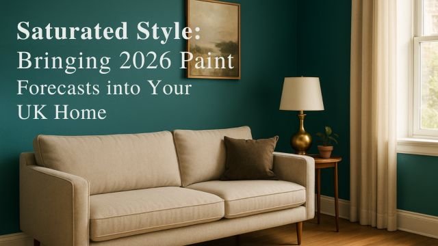
This year’s 2026 paint forecasts are all about depth, richness and connection. Not just to nature, but to memory, emotion and texture. Across the board—from WGSN and Coloro’s Transformative Teal to Pantone’s romantic lavenders and warm spice tones—the mood is immersive. These colours aren’t background noise. They speak.
Transformative Teal is the poster child of the trend, a rich blue-green that feels like forest walks after rain, deep sea swims, quiet strength. It’s versatile too. In a living room with walnut floors and antique brass lights, it feels luxurious. In a bathroom with white metro tiles and matte black hardware, it turns spa-like. It’s a paint that knows how to read a room.
You’ll also see colours like Weathered Clay, Oiled Bronze, Lavender Blue and Mustard Yellow climbing the charts. What they have in common is grounding. They don’t shout. They settle in, changing with the light, warming up cool spaces, framing favourite furniture. Whether you’re into earthy, jewel-toned, heritage or playful colour schemes, the 2026 paint forecasts are handing you a full palette of potential.
Making it work in your space
Let’s get practical. Say you’re staring at your living room and thinking “I like the idea, but I live in an 80s semi with beige carpet.” No problem. You don’t need period features or designer furniture to pull this off. Here’s how to ease into the look:
Pick the right wall
Start with a wall that’s naturally a focal point. Maybe it holds your TV, bookshelf or fireplace. Walls with clear borders work best—this helps the colour feel intentional rather than accidental.
Test your lighting
UK homes often have softer light, which means some colours may appear cooler or more muted than in showroom photos. Paint out two A4 swatches, stick them up for a day or two and watch how the shade changes in morning sun, overcast skies and evening lamplight. A teal might feel mysterious in dim corners, energising in afternoon light.
Use texture to balance depth
Colour-drenched accent walls love contrast. If you go for something dark and moody like Plum or Teal, pair it with tactile pieces—linen curtains, rattan lamps, soft boucle throws. On the flipside, a clay or mustard wall benefits from clean lines, maybe even a metal-framed mirror to bounce light.
Match the paint to your period
If you’re living in a Georgian flat with ornate cornicing or a Victorian terrace with high skirtings, consider colour-drenching the trim in the same hue. This modern trick keeps things cohesive, letting the original features blend rather than stand out starkly. Alternatively, pick out mouldings in a subtly lighter shade for a soft framing effect.
Go eco and low-fume
Most major UK brands now offer low-VOC and water-based options that are safe for bedrooms and nurseries. Farrow & Ball’s Estate Emulsion, Crown’s Breatheasy range, and Little Greene’s Intelligent Matt all come in colours that align with the 2026 paint forecasts, without the harsh chemical smell.
What UK homeowners are actually doing
You’re not alone in wanting more colour. Google searches for “colour drenched rooms” in the UK jumped by over 40% this past year. Retailers like Dulux and Crown report a marked increase in sales of saturated tones, especially in shades of green, clay, and plum. Designers note that homeowners are growing bolder—not with entire rooms necessarily, but with one or two brave walls.
We’re seeing more London flats with teal hallway alcoves, Glasgow semis with lavender stairwell backs, and Birmingham terraces flaunting clay-toned fireplaces with reclaimed pine mantels. It’s not a revolution. It’s evolution. One brushstroke at a time.
Final tips before you dip your brush
- Use high-pigment paint, especially if you’re going for a deep colour on plastered walls. It covers better and gives a richer finish in fewer coats.
- Match sheen to mood: matte for a velvety, modern feel, eggshell if you want to keep things wipeable, satin on wood trims if you like a little reflection.
- Frame with intention: if your bold wall will host artwork or a shelf, leave negative space around those items so they don’t get lost in the saturation.
- Accent the accent: scatter a few cushions or a lampshade that repeat your wall colour elsewhere in the room. It ties things together without overdoing it.
The takeaway
The 2026 paint forecasts aren’t asking you to cover every wall in electric coral or throw out your sofa. They’re inviting you to rethink how colour lives in your home. A single accent wall, drenched in one of the year’s trending shades, can shift your space from functional to memorable. It’s your chance to reflect a bit of your personality onto your walls, to create a little mood, to tell a quiet story with colour.
So the next time you stand in the aisle with a tester pot in one hand and a swatch in the other, remember: it’s just one wall. One brush. One bold move. And maybe, the start of something beautiful.